DAV Core Concepts
In this section, we explore the main actions you can take within DAV, such as toggling point sets, zooming in, and switching distance formulas. These steps illustrate why Lorentzian measurement picks different nearest neighbors than Euclidian.
Randomized Point Cloud
Upon launching DAV, you’ll see a rainbow-colored ball in the midst of white dots. This is a randomly generated spherical (and Gaussian) distribution of points, centered on the origin.
- White + Rainbow Points: All points in the cloud, with a subset “rainbow-colored” to represent distance from the origin (red = closest; indigo = farthest).
- Euclidian Distance by Default: Initially, distances are calculated with Euclidian geometry.
- Axes: There are X, Y, Z axes at the origin (though initially difficult to see through the “blizzard”).
Remove the "Far-away" Points
Often, the first step is hiding the peripheral white points. To do this, click "Show Scene Attributes" in the upper-right UI. A form appears:
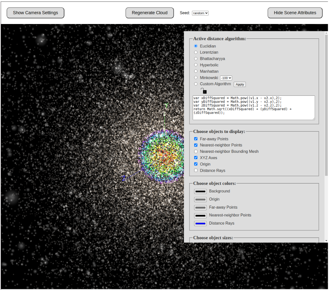 |
|---|
| Fig 1: Scene Attributes panel allows toggling of various point sets. |
Uncheck the toggle for Far-away points, then hide the panel:
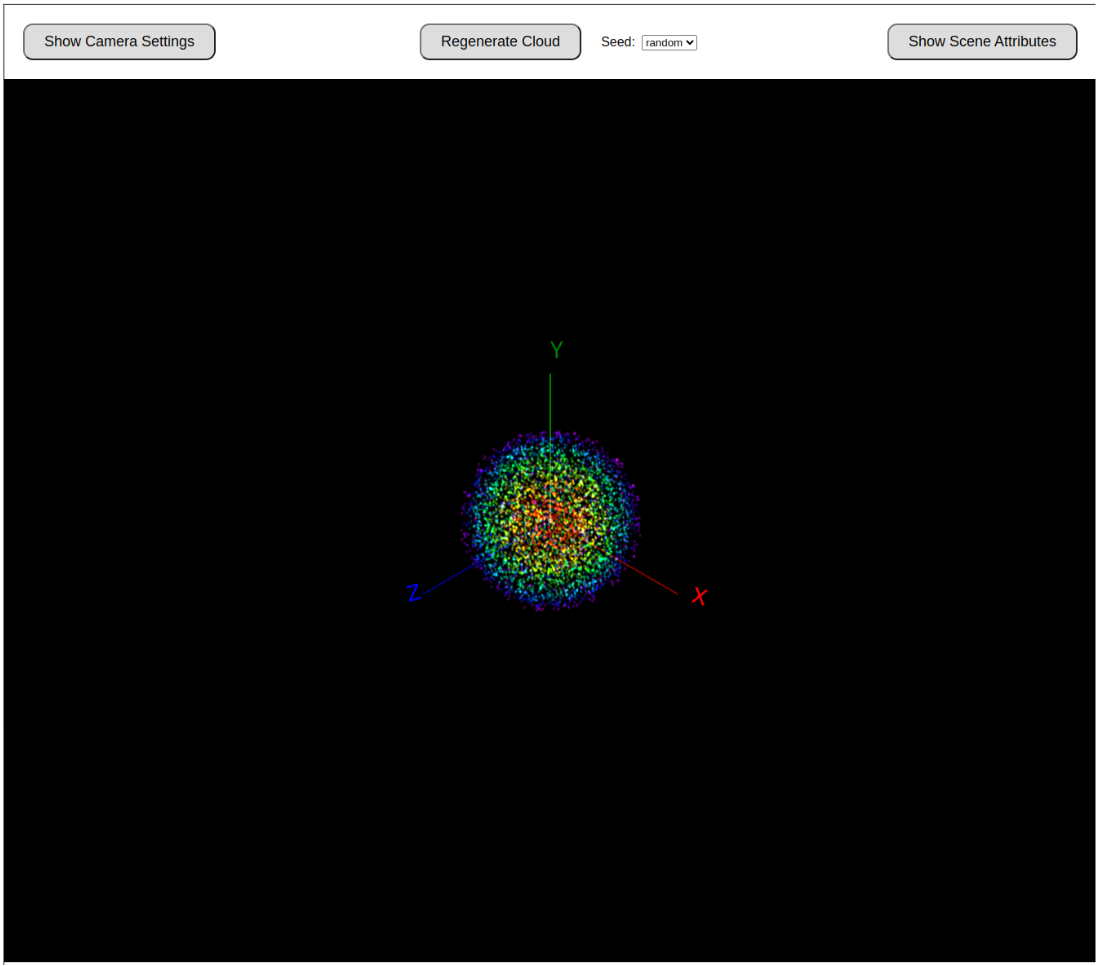 |
|---|
| Fig 2: With far-away points hidden, only the color-coded subset remains. |
Zoom-in on "Nearest Neighbor" Points
Use a mouse wheel, pinch gestures, or trackpad swipes to zoom in for a clearer view of the “Nearest Neighbor” subset (the origin + whichever points are currently flagged as closest).
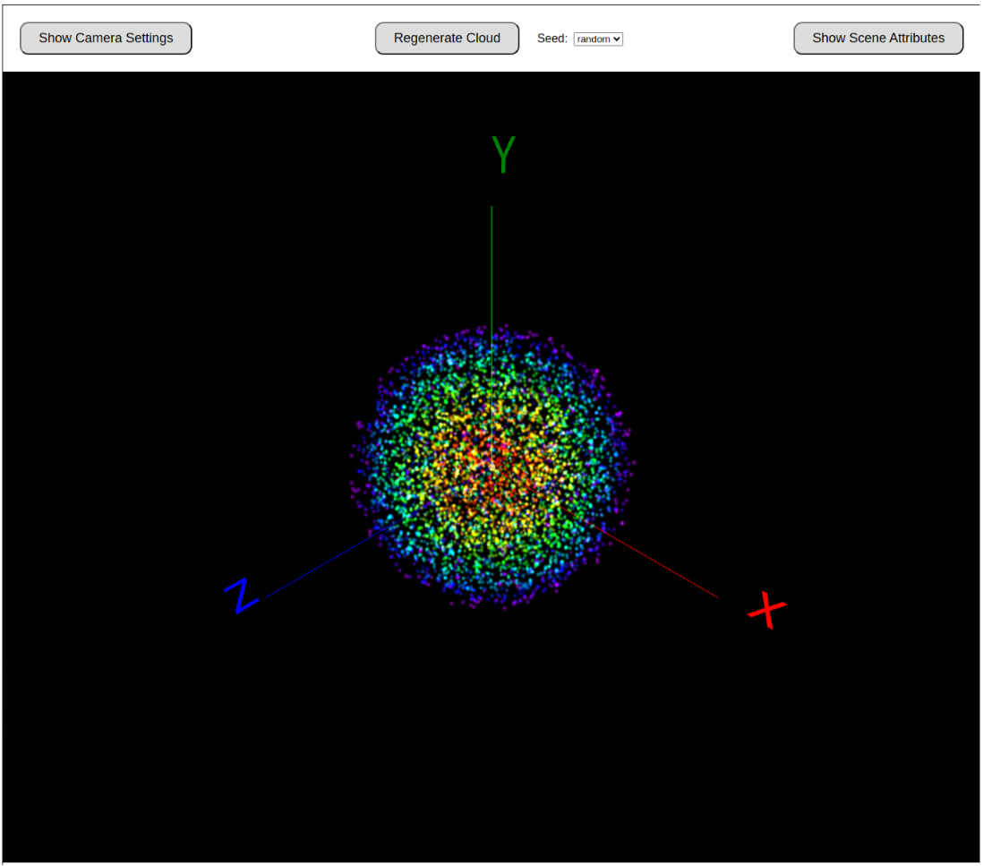 |
|---|
| Fig 3: Zooming in reveals axes and the color-coded nearest neighbors more clearly. |
Tip: Click and drag (or swipe) to rotate the view around the point cloud.
Changing the Axis Labels
To reinforce the analogy between SpaceTime and PriceTime, we can rename the axes to trading-related features—e.g., RSI, CCI, or ADX. Toggle on the Camera Settings (upper-left UI) to rename axes. You can also switch axis colors from RGB to CMY for variety.
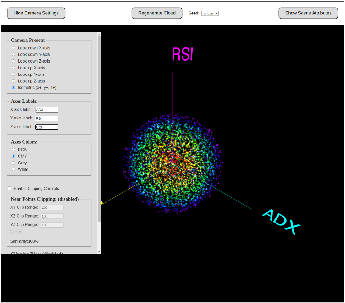 |
|---|
| Fig 4: Changing axis labels and colors (e.g., RSI, CCI, ADX). |
Using Lorentzian Classification to Find a New Set of Nearest Neighbors
Next, activate the Lorentzian distance formula. You’ll notice the shape of the “Nearest Neighbor” cluster changes because an entirely different set of points is deemed closest. Translated to a trading scenario, this implies that historical bars deemed “similar” by Lorentzian metrics can differ from those selected by Euclidian metrics.
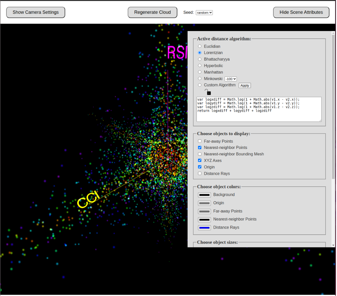 |
|---|
| Fig 5: Lorentzian distance picks a different set of closest points (notice the new shape). |
The Nearest of the Near
Scrolling further in the Scene Attributes panel, you can adjust the total number of “Nearest Neighbors” to display. You can also specify a “Nearest of the Near” subset within those neighbors, emphasizing a smaller group. This echoes the idea in Justin’s video of only a few data points “casting their vote” on the next possible market move.
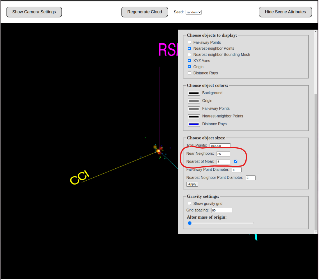 |
|---|
| Fig 6: Fine-tuning the number of nearest neighbors and highlighting a subset. |
Other Distance Formulas
DAV also provides additional distance formulas—like Hyperbolic—and even supports custom user-defined formulas (in JavaScript syntax). Each formula can dramatically alter which points are considered nearest to the origin.
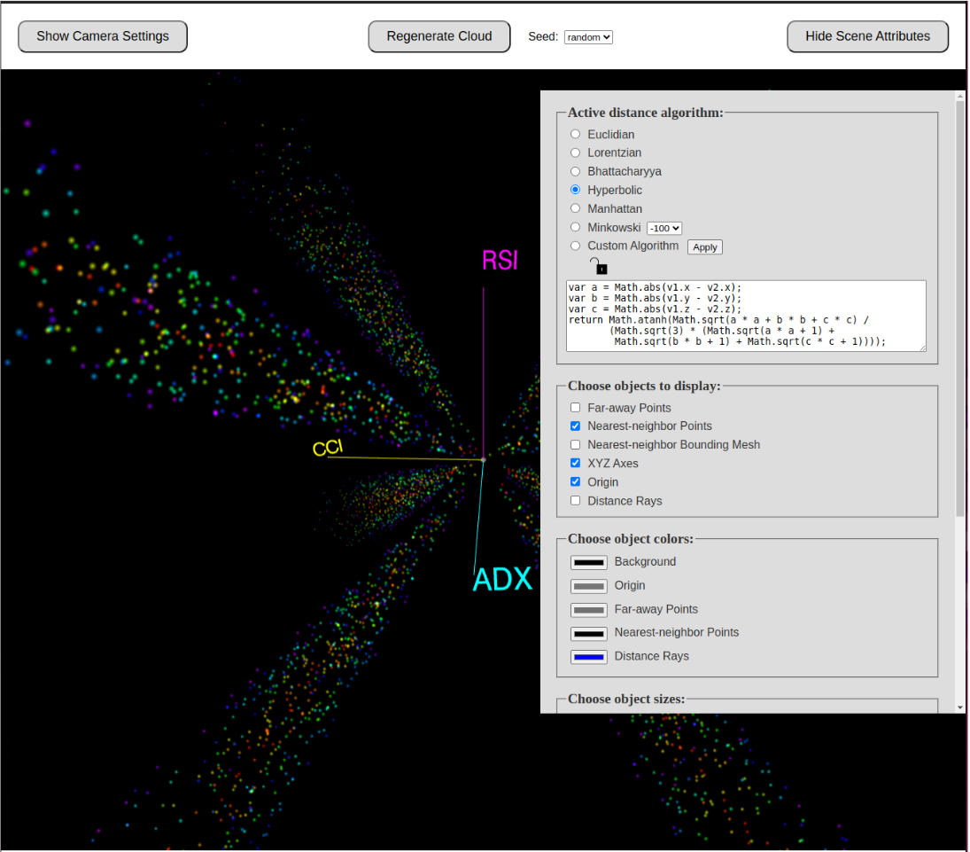 |
|---|
| Fig 7: Selecting Hyperbolic or your own custom distance formula to explore alternative neighbor definitions. |
Putting It All Together
By toggling far-away points, switching axes, and swapping distance formulas, DAV helps illustrate why Lorentzian distance can outperform Euclidian in certain applications—particularly in “warped” market environments where the geometry of price action doesn’t behave like a flat Euclidian plane.